Design system for e-commerce platform
Einktab is a direct-to-consumer (D2C) e-commerce platform for e-ink devices and accessories, integrated with Best Buy Canada and Walmart to support multi-channel distribution.
Design system impact
2.5×
design delivery speed increased
80%
of time spent on tasks, not searching components
50%
reduced developer onboarding time by
Years
2025
Applied skills
Workshop Facilitation, Design Thinking, User Interviews, Design Systems, Prototyping, Information Architecture, Usability Testing, Visual Design, UI Implementation, CSS/HTML
Team
Founder & Product owner, Product Designer (me), Marketing manager, Developer
The problem
The product is over helmet by similar fonts and colors, duplicating elements, not scalable and non-responsive layouts.
Legacy system issues
54
unique colors
18+
button variations
the goal
Designed a cross-platform system with reusable components to streamline design–engineering handoff, accelerate delivery, and maintain intuitive patterns for a seamless user experience.
The solution
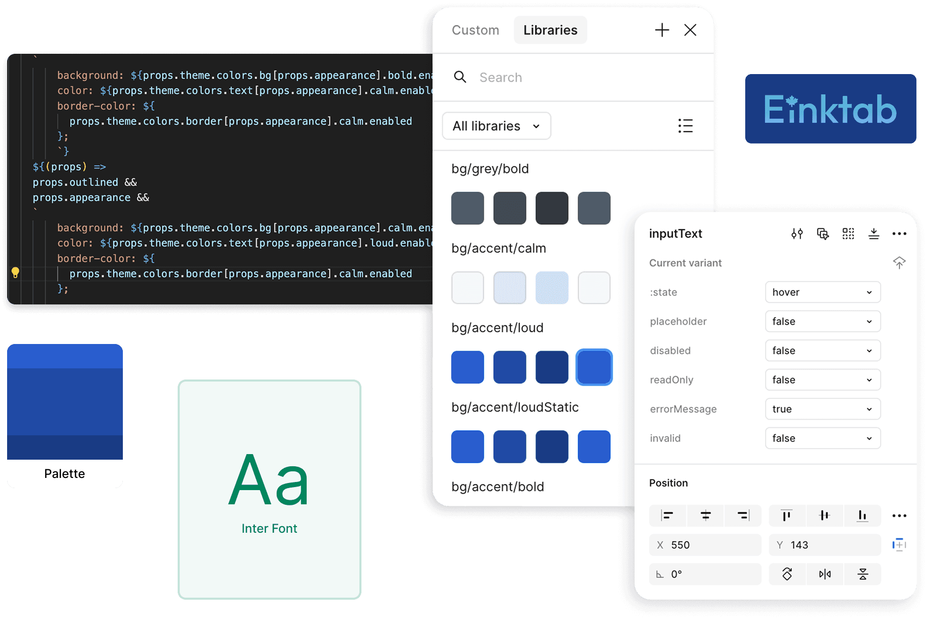
To ensure strong alignment between design and code, I manually built a structured design token system from the ground up.
By leveraging Figma variables, I enabled easy theming and consistency across components, while creating a token structure developers could reliably implement via our shared GitHub repository.
This hands-on approach gave us full control, flexibility, and a deeper understanding of how our system scales.

Design process
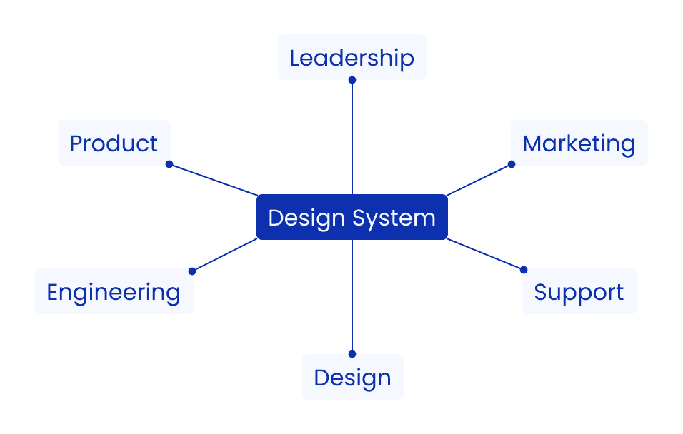
Ensuring design system adoption through team communication
To ensure adoption and consistency, I actively collaborated with cross-functional teams—aligning on needs and priorities to build a scalable design system that improves the end-user experience.
Workshop
Team-driven evolution of design principles
As the founding designer, I created a scalable brand book rooted in core design principles. I later led cross-functional workshops with the team to collaboratively refine those principles as the brand evolved, ensuring long-term consistency and alignment across product and marketing.

Design System Audit
Evaluation of the current design system
Auditing the product helped surface the most-used components and key visual inconsistencies—informing priorities for the initial design system.
The example below shows inconsistent Header 2 usage, with over five different font sizes identified in the design audit.

Establishing the Core Design Tokens
Semantic token naming for system clarity and scale

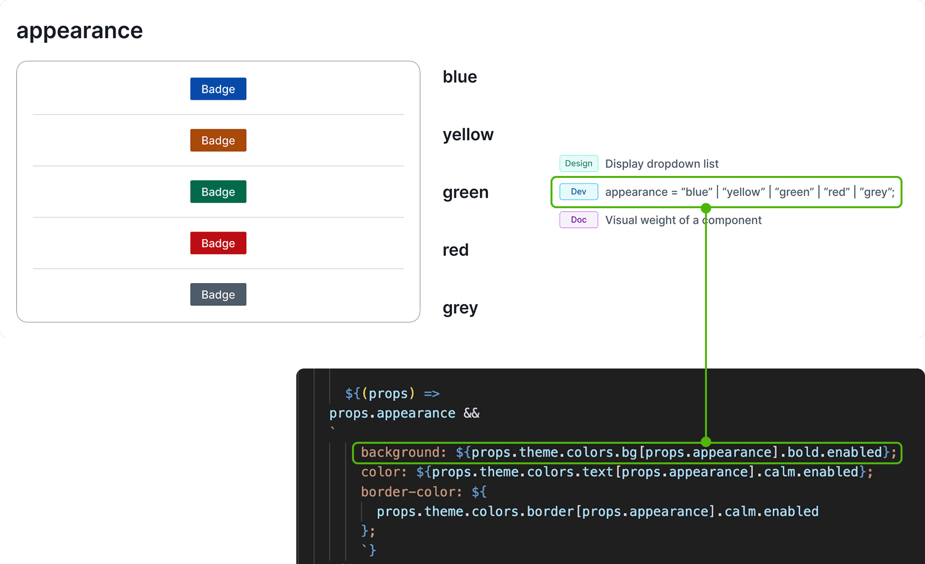
I used a semantic naming approach across core system elements—colors, typography, radius, shadows, and Z-index—naming each token by its function and context. This ensured consistency, simplified developer handoff, and supported scalability.
Color system foundation
WCAG contrast as the foundation of the color system
Accessibility was the foundation of the color system. I created a universal palette from scratch using the HSL model, applying defined brightness and saturation coefficients.
All interactive states were designed to meet WCAG AA, with most achieving AAA compliance. Transparency was avoided to ensure readability and maintain full control over contrast and layering.
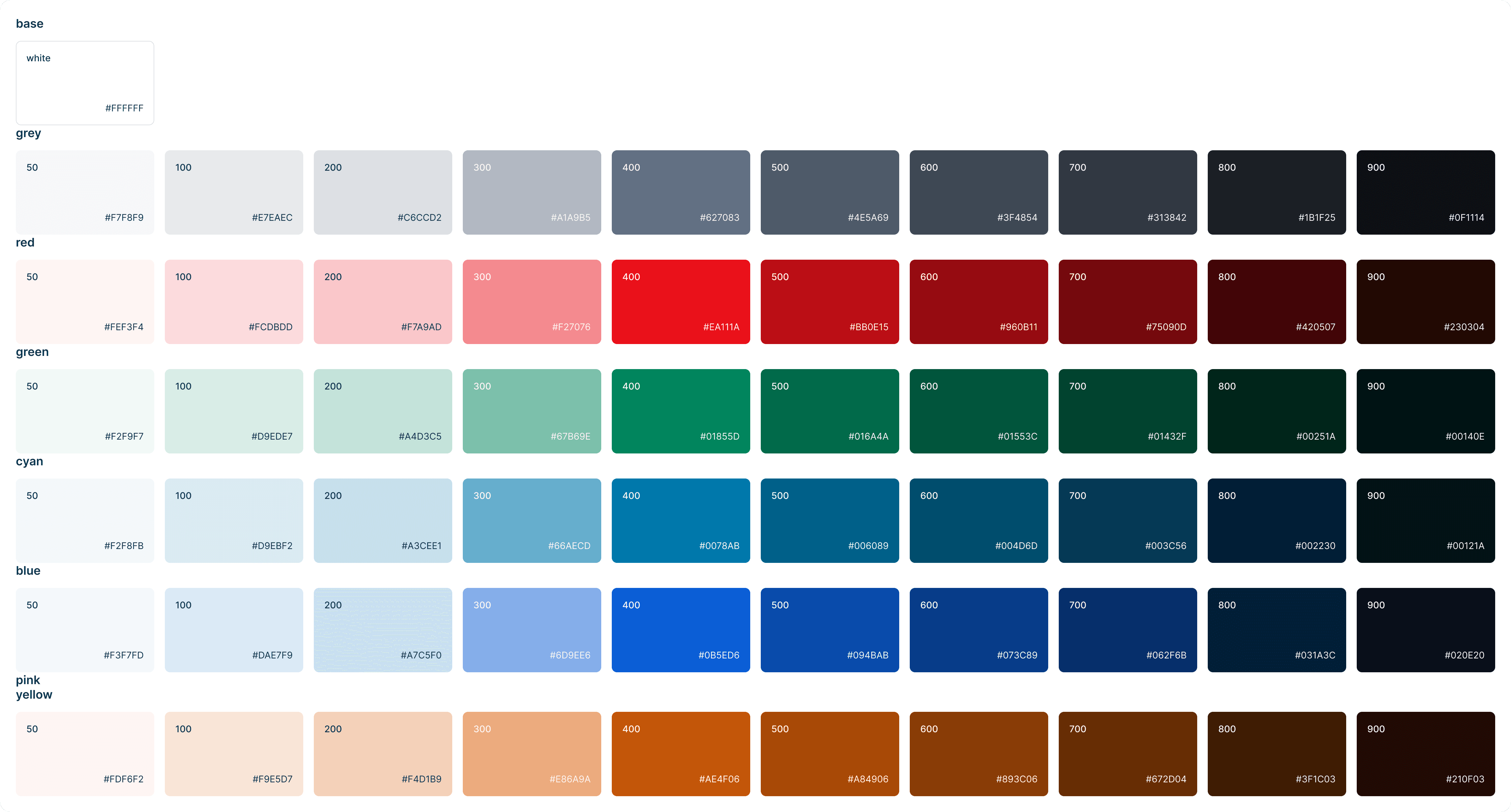
Color tokenization: semantic per group approach
I introduced a semantic, per-group color token strategy, embedding component states directly into token names.
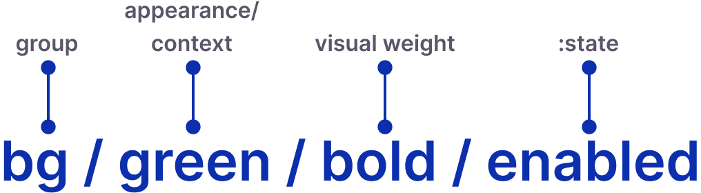
By naming tokens after actual color values instead of abstract roles, I reduced ambiguity, improved designer–developer handoff, and set a foundation for long-term scalability.
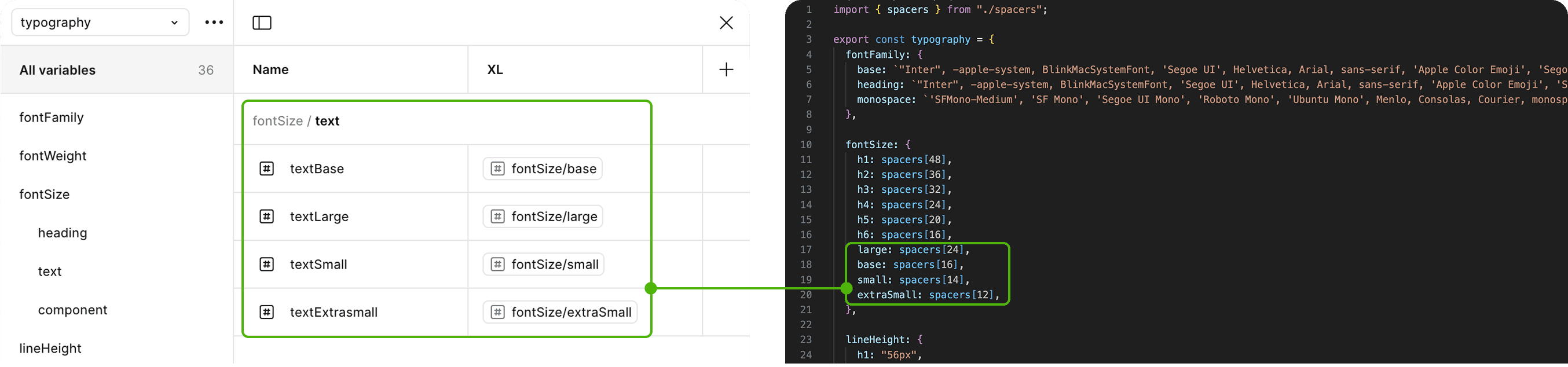
Typography tokenization
Semantic naming over t-shirt sizing for typography tokens
To ensure clarity and scalability, I applied semantic naming to typography tokens, which improved team communication, simplified multi-brand scaling, and accelerated onboarding.
corner radius tokens
Semantic naming for corner radius tokens
When strict formulas didn’t deliver optimal results, I applied visual compensation based on UI best practices. Tokens were named semantically, based on real use cases, allowing for consistent, intuitive implementation across the system.

spacing tokens
Spacing token strategy informed by gestalt proximity
I applied Gestalt’s proximity principle to define spacing based on logic, not just appearance. I identified four relationship types—related, grouped, separated, and independent—based on how elements interact in the product. This helped align layout decisions with real user flows and product behavior.

Optimizing for Real-World Product Development
Component-based architecture vs. Atomic design
I chose the Component-Based Approach to improve cross-team collaboration and reduce implementation ambiguity. By aligning tokens with real UI components, it enabled faster handoff, consistent cross-platform design, and a scalable foundation for long-term product growth.

documentation and Integration
Enhancing design-to-code workflow
Implemented an efficient handoff process by creating detailed specs, coded component descriptions in Figma, and Storybook documentation to streamline development.
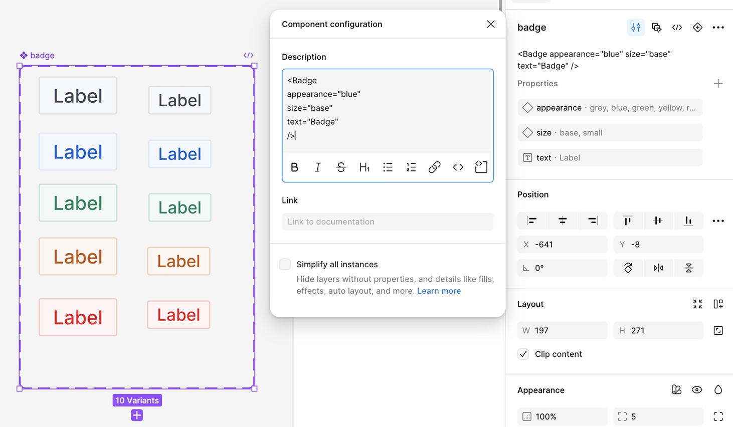
Streamlining dev handoff with Storybook
To document, test, and communicate components efficiently, we used Storybook as part of our design system workflow. It enabled us to:
Store real, production-ready components for direct use in code
Test components in realistic scenarios and states
Preview responsive behavior across screen sizes
Document component variants interactively, improving collaboration between designers and developers
Iterative testing
Design system validation and feedback
The test phase was crucial for the successful implementation and long-term sustainability of the design system, so a led:
Functional testing across all components
Manual interaction testing in Storybook
Accessibility checks (WCAG compliance)
Usability validation through team feedback
A feedback loop to support continuous improvement

Results
Design delivery speed increased 2.5× (from 3 days to 1)
Designers now spend 80% of their time on solving tasks, only 20% on finding components
Developer onboarding time reduced by 50%
Maintained brand consistency across all products
Next steps
Improve documentation in Storybook and Figma
Add components for key e-commerce flows
Maintain cross-team feedback loop
Extend design tokens for scalable branding
Track adoption and optimize usability
Lessons learned
Design for reuse early
Limit variations
Decouple the system
Use a modular monorepo
Design with dev in mind


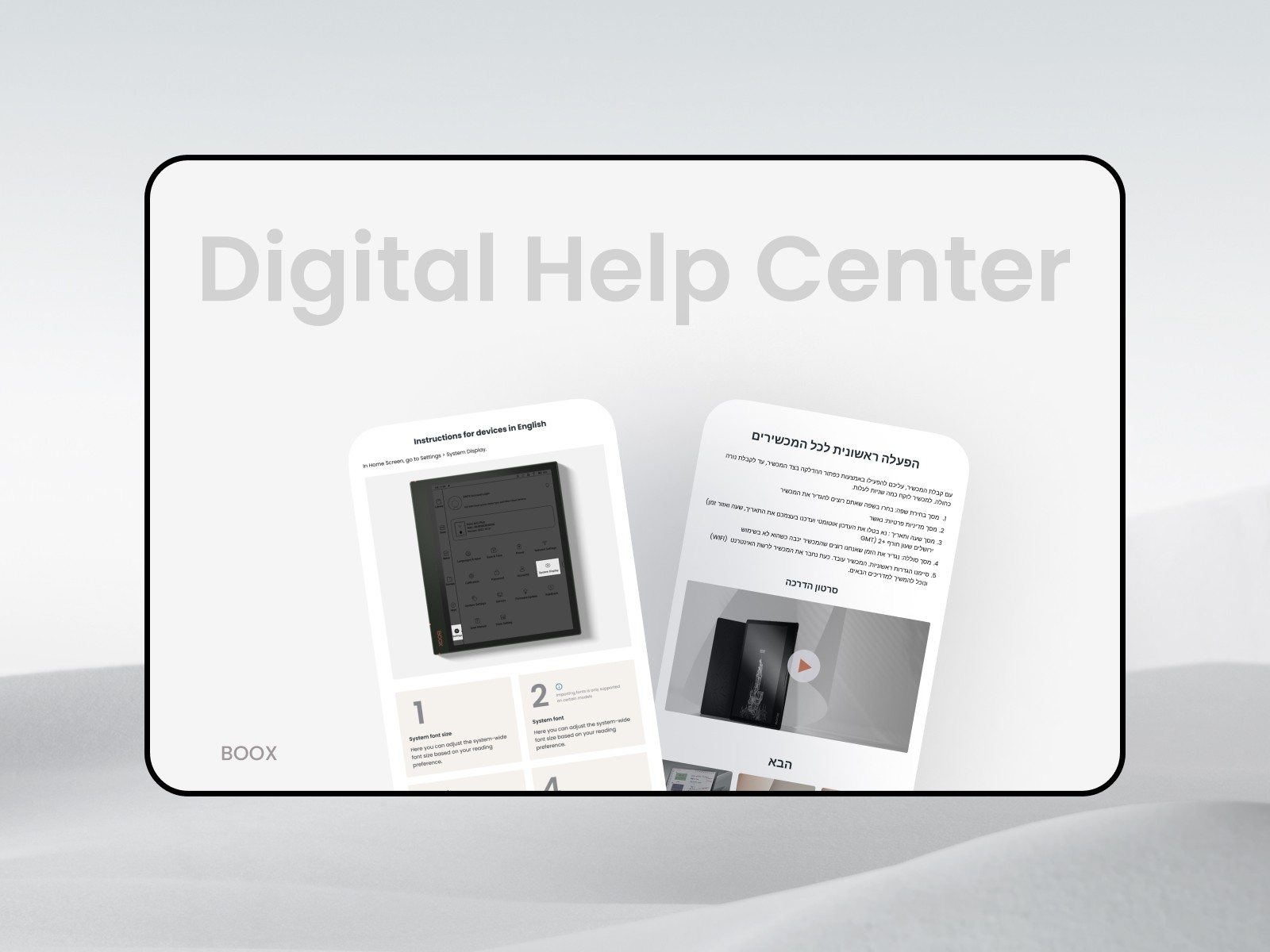
E-commerce Redesign for BOOX: Improving UX and Product Discovery