
Boox is a global brand of Android-powered e-paper tablets and eReaders, known for delivering a paper-like reading and writing experience using E Ink technology. Devices are primarily sold online through regional distributors worldwide.
Design impact
75%
faster resolution
50%
number of returns decreased
20%
lower operational costs
business problems
Users returned products due to missing setup guidance
Support team overwhelmed with basic, repeatable questions
Negative reviews citing poor onboarding experience
Customers abandoned products, losing trust in the brand
Increased costs from avoidable support interactions
user problems
Difficult to understand how to use; long learning curve for new users
The official user manual was only in English and missing key topics for local users
The web store’s general information and FAQ sections were missing key details.
Online search didn’t return relevant results
The goal
Reduce support team workload and improve user onboarding by delivering a self-service Help Center tailored to local user needs.
Challenge
Rapidly growing volume of instructional content
Tight deadlines and resource constraints
Final design solution
Designed and launched a localized Help Center tailored to user needs, including a custom user guide, multi-language support, and structured, categorized content. Implemented a search bar optimized for key user queries to improve discoverability.
research
Understanding user needs
I partnered with the Customer support team to uncover recurring user pain points, then backed those insights with desk research—scanning real user reviews, forums, and video comments to capture authentic feedback.
Key drivers of high return rates
Based on the data, I identified two main causes behind the high return rate—one we could influence through UX improvements, and one outside our control.
Actionable
80%
Difficult to use without guidance
Out of scope
20%
User dissatisfaction with display quality
Defining and prioritization user problems
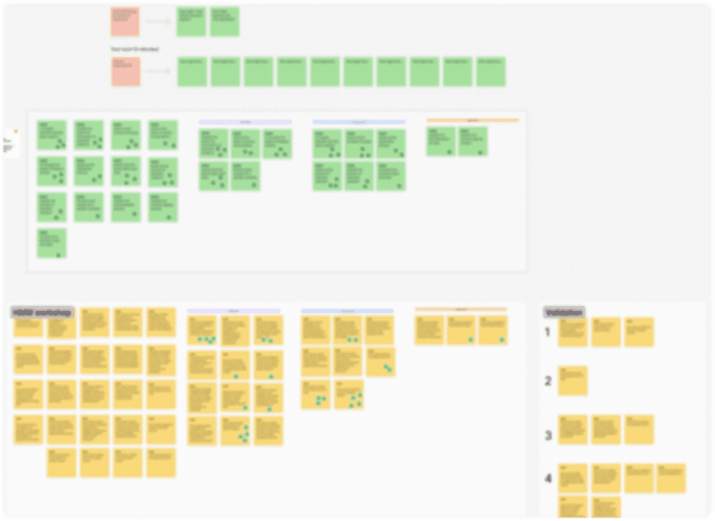
To define and priorities user problems, I led a collaborative workshop where we framed key user challenges, and used dot voting to prioritized user pain points. Sort problems by categories.
Seeking and validating solution ideas
To find ideas for solutions, I led a collaborative workshop where we framed key challenges as 'How Might We' questions, brainstormed ideas, clustered themes, and used dot voting to prioritize and systematized ideas for solutions.

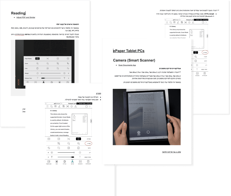
Creating localized content
After validating solutions, we created clear, local-language content to reduce confusion and improve guidance. Localization wasn’t just translation—it was a step toward inclusivity and a more intuitive user experience.

I supported the linguistic localization of BOOX devices—adapting complex UI terms to fit the language, layout, and typography, while ensuring clarity and consistency across screens.
prototyping
Refined the Help Center UI based on user research
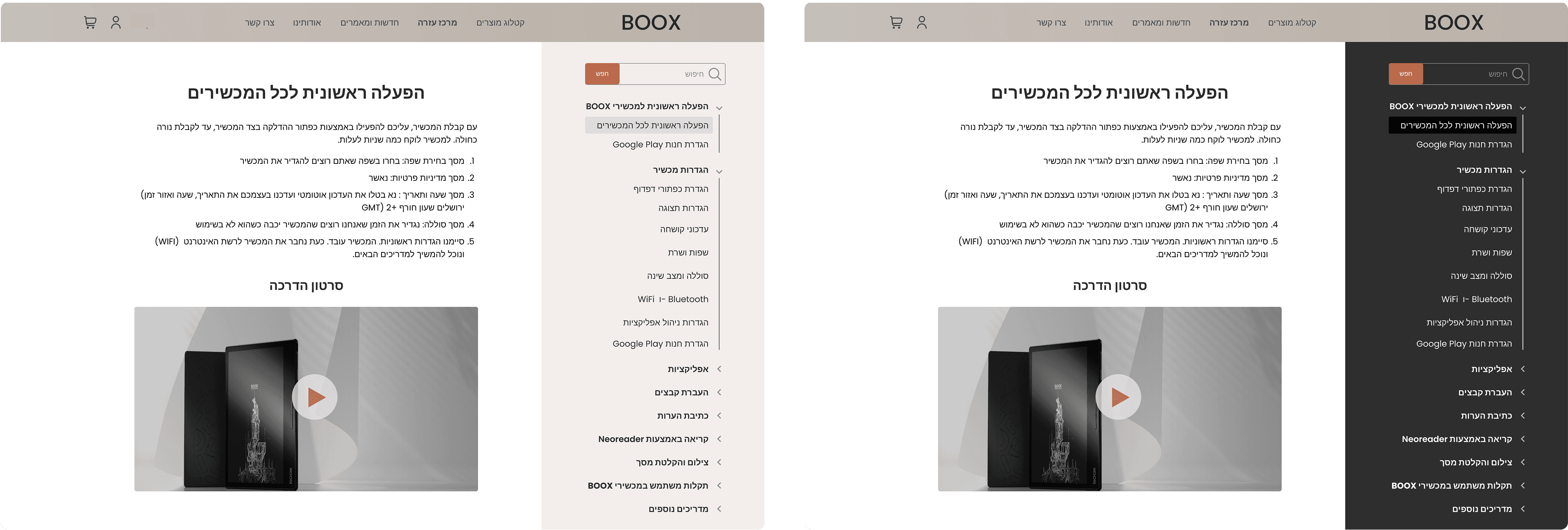
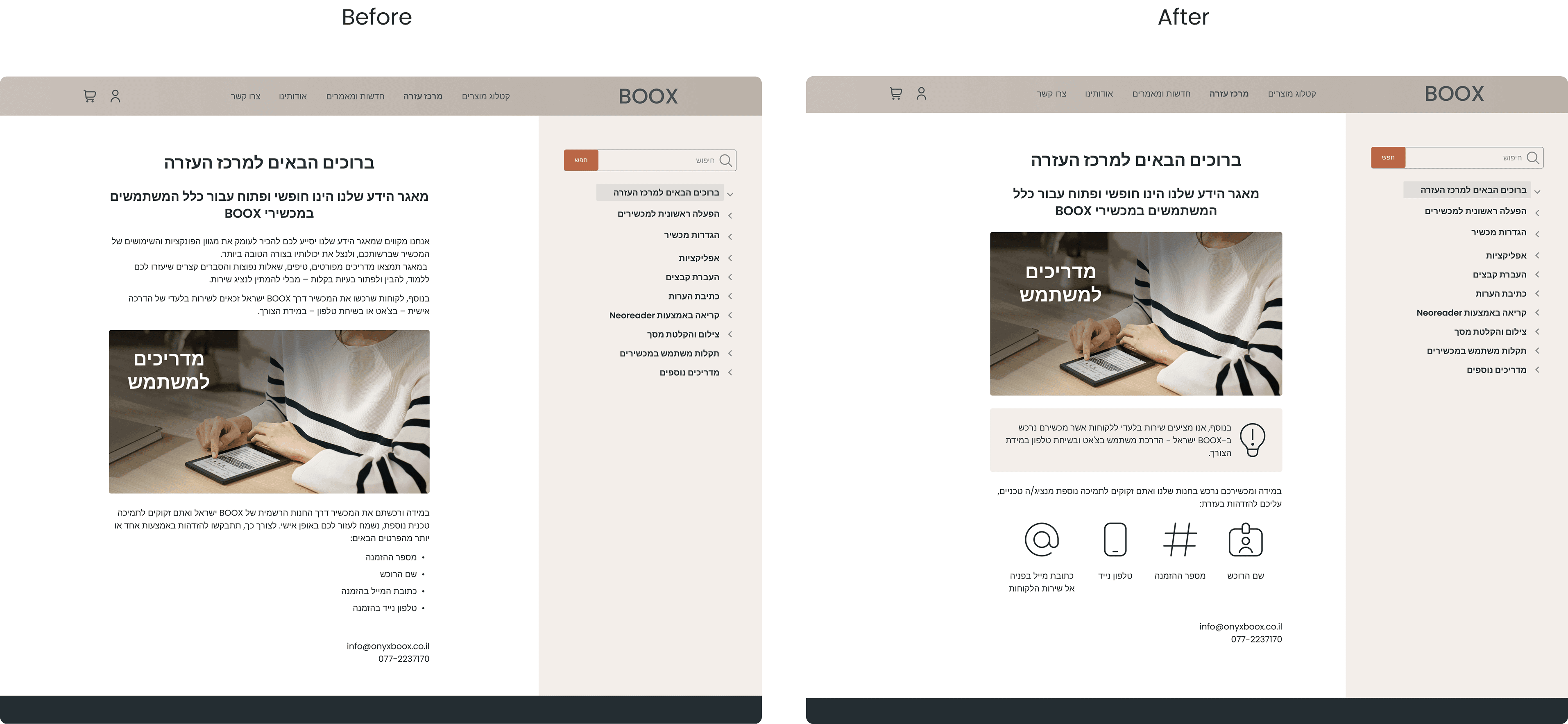
Beyond UX issues, the Help Center's start page also faced key UI challenges—including poor visual hierarchy, SEO-heavy content, and an accordion layout that didn’t scale with growing instructions. This resulted in a cluttered experience where users struggled to find the information they needed.

challenge #1
Discoverability and navigation
To improve discoverability and reduce user effort, I introduced an accordion-style navigation panel and redesigned the layout to support easier browsing and scalable content. I also added a search bar optimized for common queries to enable fast, self-service access to answers.

challenge #2
Balancing global branding with local UI
While BOOX’s global design uses a dark colors, we prioritized user familiarity and kept the Help Center light—aligning with the existing local UI to ensure consistency and reduce confusion.
challenge #3
Bridging marketing goals with user needs
The page was packed with SEO content, making it hard for users to navigate. I collaborated with marketing to refocus the content around user needs, and added icons and structure to make key information easier to find, read, and act on.
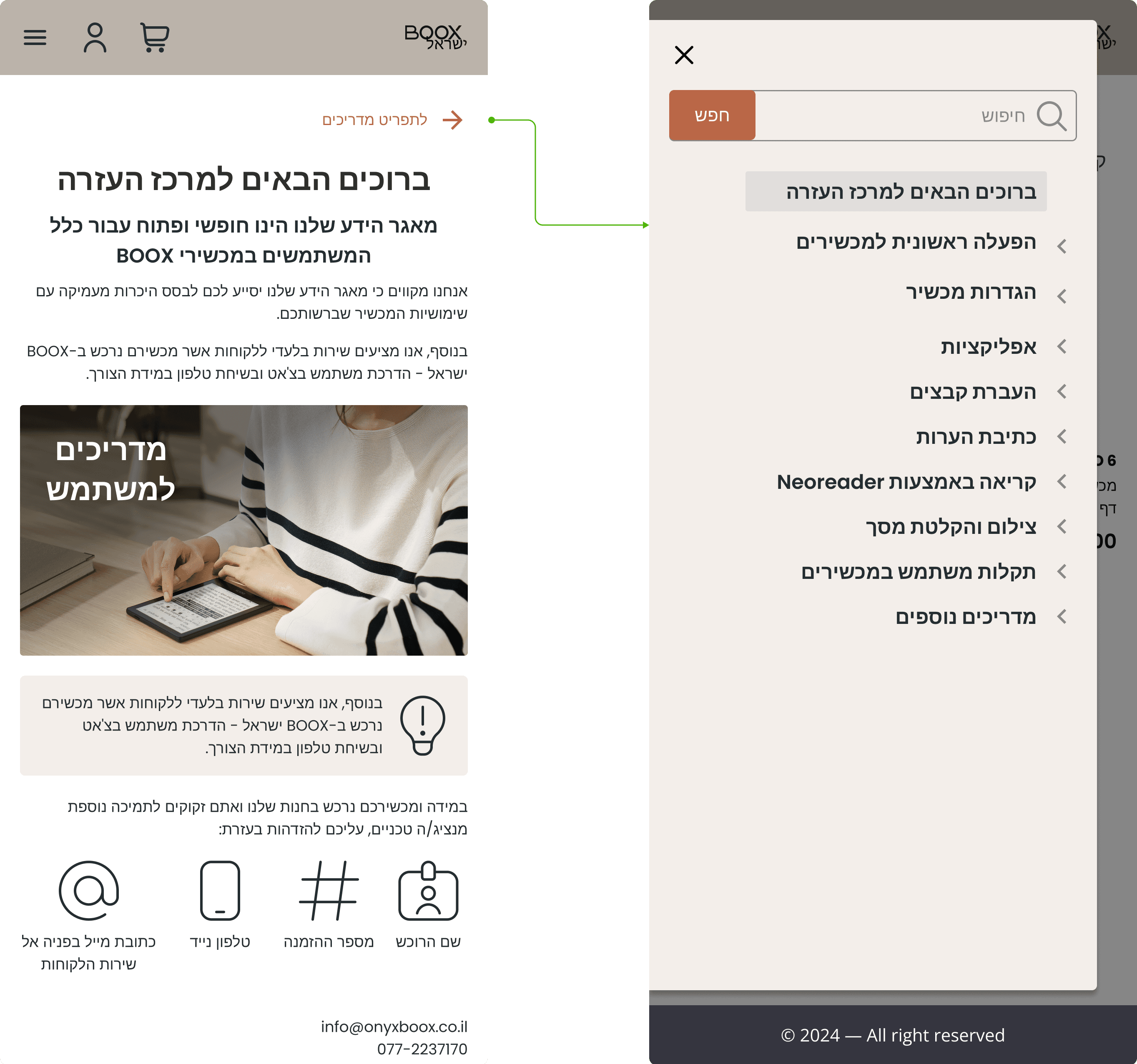
The mobile version
prototyping
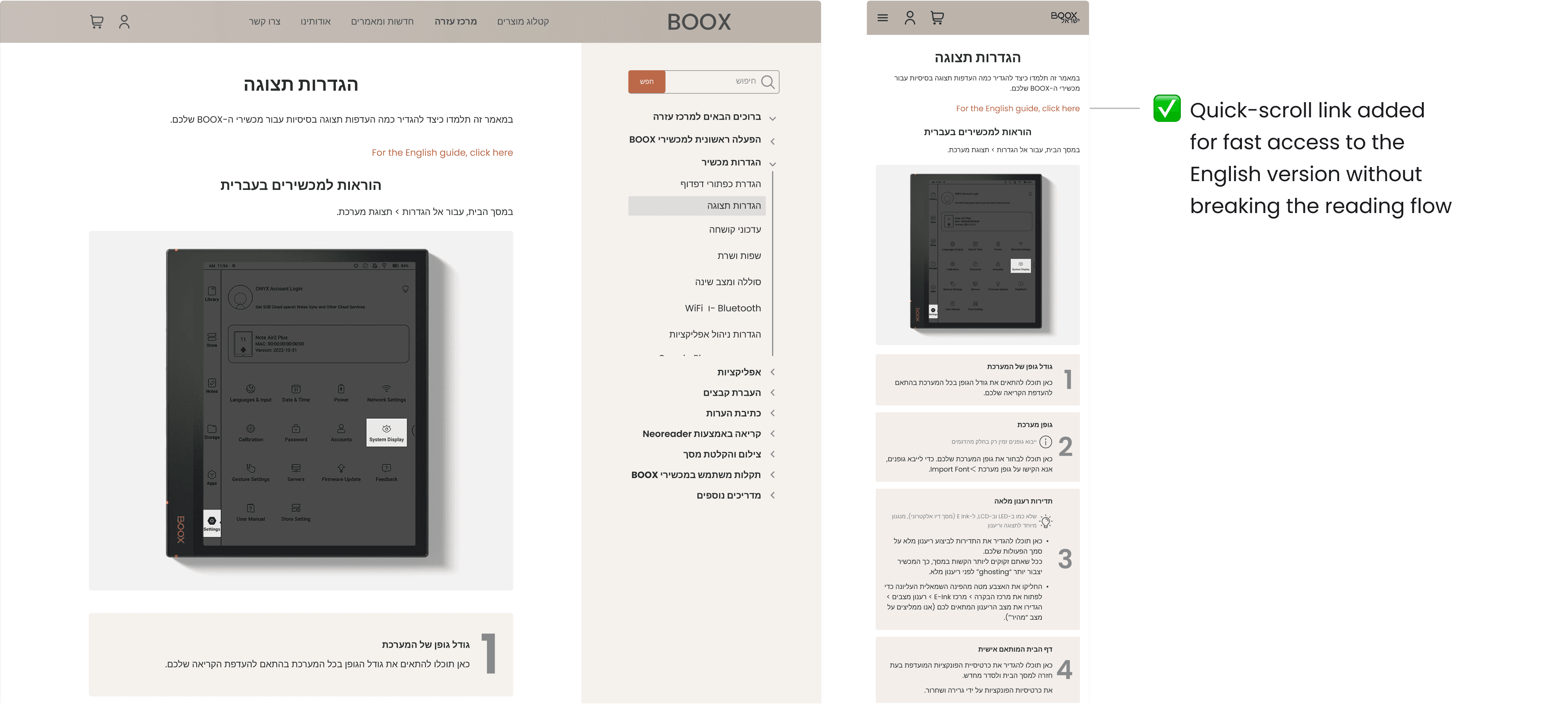
Guidelines redesigned
The initial Help Center guides were PDF-based and created a frustrating user experience. Limited hierarchy, overwhelming content, and unclear navigation made it hard for users to find what they needed.

Challenge #1
Readability and structure
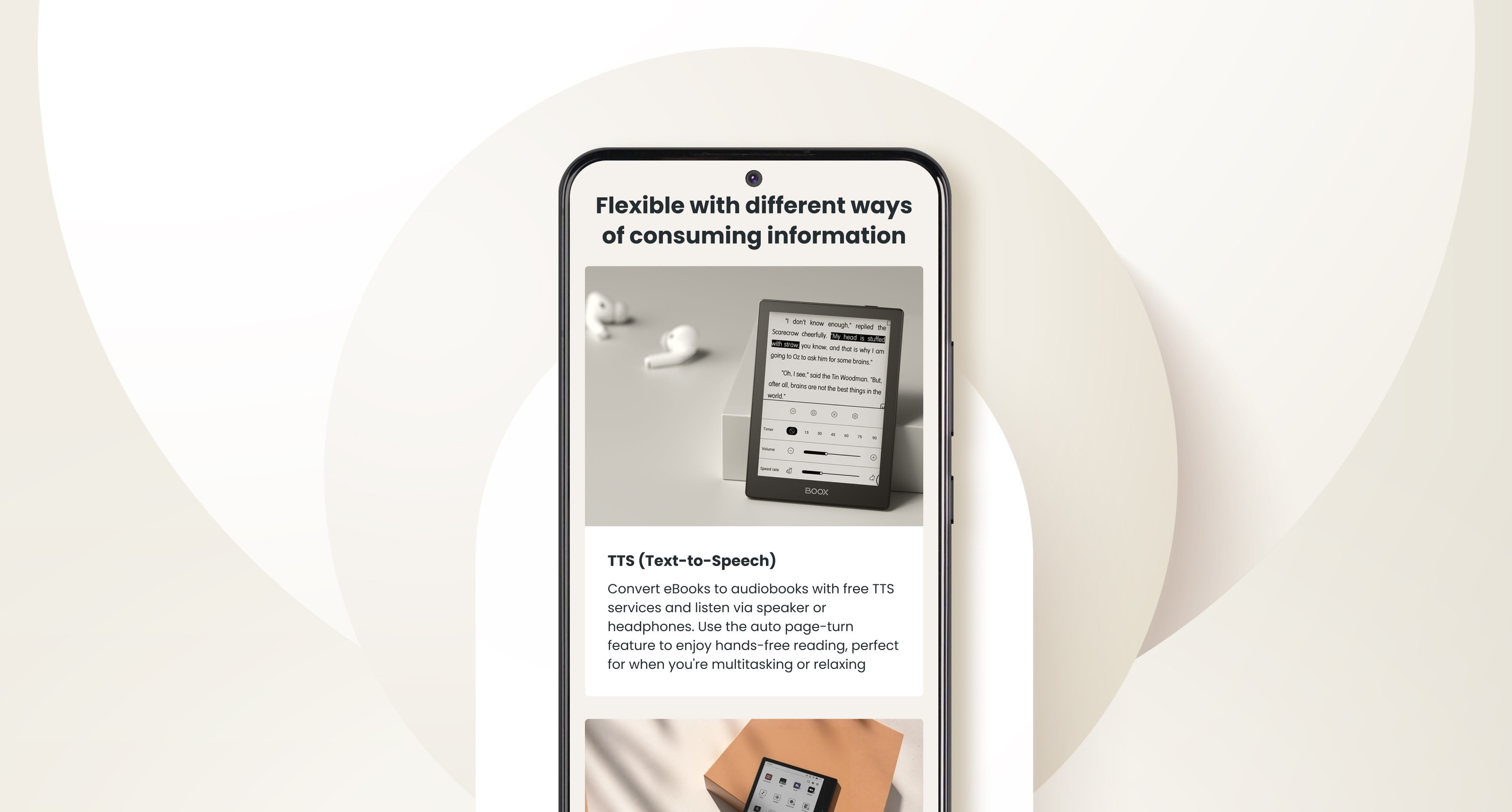
I created multiple versions to optimize the design for expanded content and improve readability. Guides were restructured into clear, numbered steps with titles, expandable details, and icons for easier scanning.

User testing revealed that the two-column layout was confusing and slowed task completion. I switched to a single-column format, organizing each step into its own clearly defined section—reducing confusion and helping users complete tasks faster.

challenge #2
Bidirectionality
The local market had a unique need—while most users preferred Hebrew, others used devices in English and needed matching guides. Showing both languages on one page caused clutter and broke the reading flow.
To solve this, we placed the English version below and added a quick-scroll link for easy access, supporting both audiences without disrupting the experience.
Number of returns decreased by 17% after launching the improved Help Center.
Positive reviews mentioning “helpful support” increased by 15%.
Calls to customer support dropped by 20%, as more users found answers through self-service.
Integrate an AI chatbot for general support to reduce human support load
Continuously expand user guide content to keep information current as models and firmware evolve
Add in-page feedback to help articles to identify content gaps and prioritize improvements
Using Low-Hanging UX Wins Strategically
Localization is Not Just Translation — It’s Cultural Adaptation
Early Partnership with Customer Support Surfaces Real Issues Faster
Design system for e-commerce platform
